


At this point in the transition from Beachboard to Canvas, most CSULB professors have made the switch to Canvas. For the upcoming fall semester, the Beachboard platform will be completely phased out.
For many students, this change has been welcome. Canvas is commonly used by community colleges and high schools and familiarity is always a comfort. However, the drawbacks of Canvas outnumber its benefits.
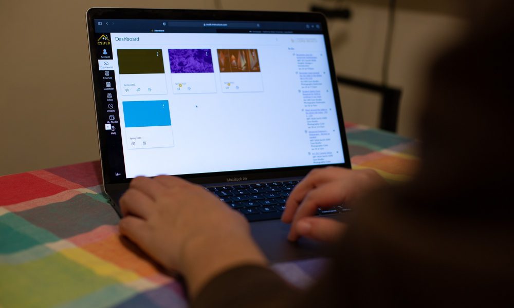
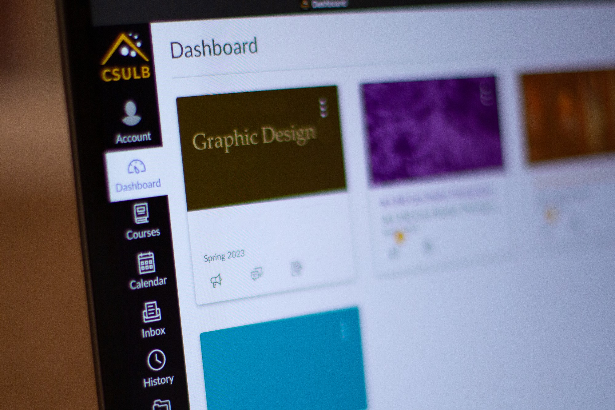
![Philosophy graduate student, Joe Gordon, uses his laptop. "From a student&squot;s perspective, I don&squot;t really see a difference [between Canvas and Beachboard]. From an administrative perspective, I&squot;ve heard about some issues with Canvas," he said.](https://daily49er.com/wp-content/uploads/2023/02/MPL5952.jpg)
On Canvas, announcements and assignments are all in different menus that cannot be open at once in the same tab. Similarly, Canvas lacks the “discussions” drop-down tab.
Canvas also does not use different icons for types of files. On Beachboard, videos, PDFs, and links all have different icons, making the files easier to sort through.
Another issue of clarity is the way in which files are downloaded on Canvas. There is no download button, instead students must click on what appears to be a hyperlink in order to download a document.
The “modules” menus are just as awkward. On Beachboard, tapping “content” for a class would open up a table of contents on the left and the actual contents on the right. Because of the list on the left, it was easy to navigate between all of the content for a class.

However, on Canvas, students must scroll through all of the modules, which automatically expand when the modules menu is opened, making them more lengthy to navigate.
Although this may only be a temporary drawback during the transition, Canvas does not yet have pages for certain majors and organizations. This means that if students want to look at announcements from their department, or organizations like ASI, they will likely still have to check Beachboard.
While each of these flaws might sound insignificant on their own, the overall picture painted is that Canvas is an overall loss. It’s been difficult enough for students to balance their coursework between two separate platforms and it’s unfortunate that this sacrifice is being made for a worse website.
This story was edited on Feb. 7, 2022 for clarity and quality purposes.